
Streamlining Multi-Modal Navigation
Multi-Way is a multimodal navigation app that rivals leading navigation apps which are integral to how people get around and gauge current traffic conditions to plan their commutes. However, these apps lack the freedom and flexibility to select more than one form of transportation (multimodal) to plan their route. This is where the idea of Multi-Way was born.

iOS Mobile App
UX Designer
Team
Feb - Apr 2024
Goal-Direct Design, UI Design
About
“Multi-modal transportation is in demand, nearly 70% of millennials use multiple ways of getting around cities and suburbs,” according to the American Public Transportation Association. Fewer and fewer people are purchasing a car, the number of people not buying a car has doubled from 8% to 16% in the last 10 years.
While there are popular apps like Google Maps, Apple Maps and Waze that help people get around, they are very car-focused solutions that don’t have the most intuitive experiences when navigating with more than one form of transportation (multimodal). With the growing demands of multi-modal transportation, the need for a more intuitive and flexible navigation experience, the pain points of owning and driving a car, and the global desire to lessen our carbon-footprint, the idea of Multi-Way was born.
Problem Statement
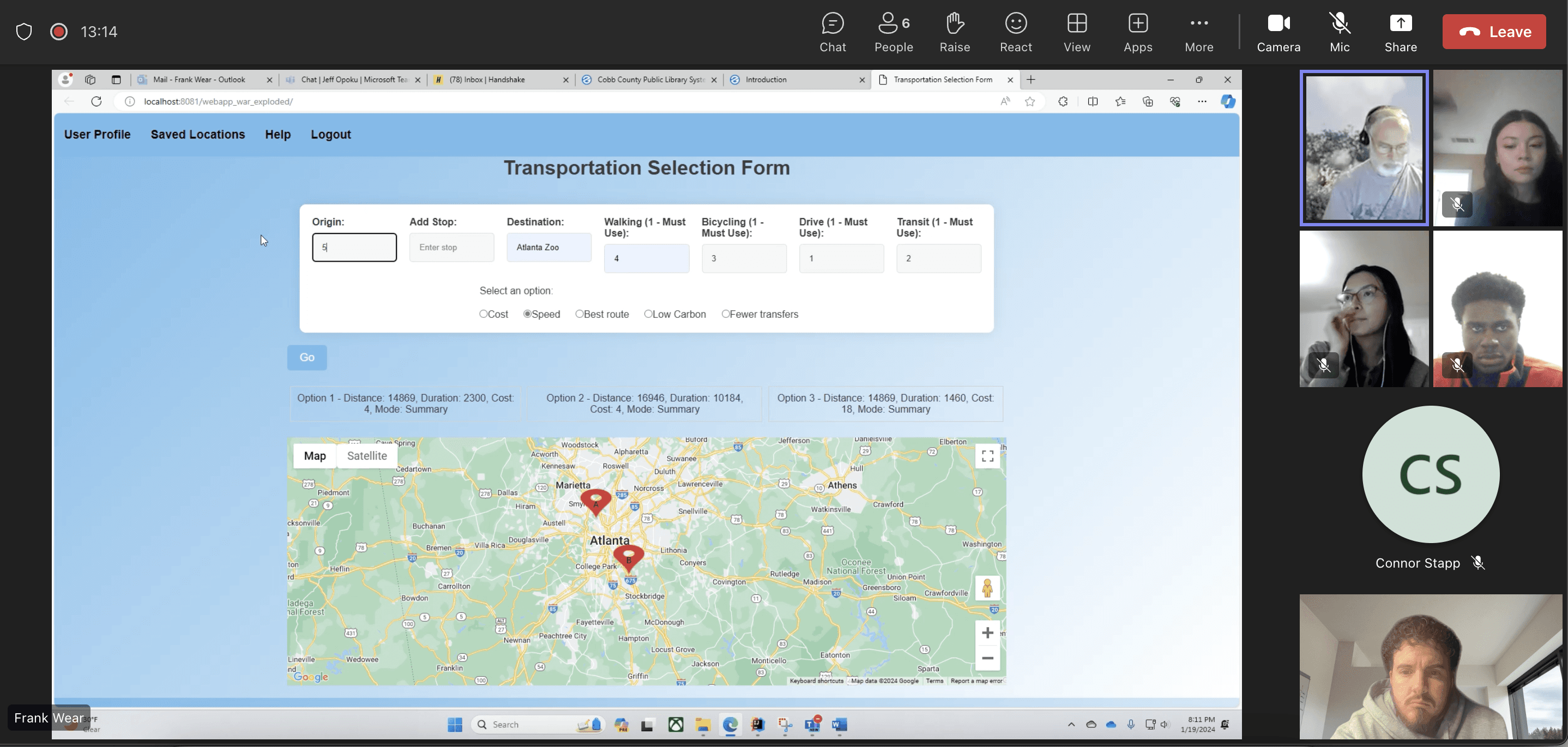
The app idea was conceived and built by a software developer, and KSU alumni, Frank Wear but had limited to no UX involved in its development process. We were given a demo of the MVP and realized there was a unique opportunity to improve its design, its user-friendliness and usability.
We pitched the idea to work on this project, and after getting permission from our professors and Frank, we set up a project kickoff meeting with Frank who, as the founder, would act as our stakeholder.


Process
Project Kickoff: To start, we wanted to understand the: idea, goals, problem space, target users, how the app was developed, what work (process) went into the original version, long and short term goals, and what Frank could expect from us. The project’s goal is to empower people to more easily get around using multi-modal transportation, effectively saving money while streamlining the navigation experience. Its target users are people who do not drive or own a car, desire flexibility and reside in areas with good transit options (such as rental bikes and scooters, rideshare, bus, rail and subway).
When we saw the initial design, the team noticed the user options in the transportation selection form were very confusing and the results it gave once entering their selections were also very confusing and unclear. The short-term goals were to complete the UX work and create designs for a mobile app that would leverage Google Maps API for the maps, traffic data and route information. The long-term goals would be to hire more engineers to build the app, raise funding and to partner with local transit authorities like MARTA to offer in-app fare purchase, as well as link to other apps like Bird, Lime, rental bikes, and rideshare services based on user selection.
Our team was to send Frank a weekly summary of what we did each week and what we had planned for the next week. Frank’s role was to be available for help when needed. From this point forward, Frank was minimally involved besides our communications each week. He would join us in the early discovery phase when we had meetings with subject-matter experts (SME’s).
Research & Analysis: We started with a competitive audit on apps like Google Maps, Waze, Apple Maps and Moovit. We also conducted five user interviews and two subject-matter expert interviews with Todd Litman, 35-year expert in the research around transportation options and its impact on health, environment, spending, etc. He is also author of New Mobilities: Smart Planning for Emerging Transportation Technologies. We also interviewed Alex Norton, an urban planner in Jackson, Wyoming.
Competitive Audit Findings: Waze has inconsistent experiences between Android and iOS, Google Maps and Moovit rely on user-generated data which can lead to outdated information and poor routes (heavier traffic), Here WeGo and Moovit have a UI that is cluttered and confusing to first-time users and Moovit is also very ad-heavy and prohibits certain features (specifically when riding public transit) unless you buy a subscription plan.
User Findings: Through our user interviews we found that people tend to use multi-modal transportation options more often in areas where they are more readily available, like large cities and internationally in places like Europe and Asia, they have reservations and safety concerns about their local public transit (MARTA), pain points with using public transit such as lack of signal at some of the Marta stations, they consider convenience, cost, time, safety and overall efficiency when it comes to planning their commutes.
SME Findings: Our biggest take-aways from these conversations was that people are not rational and tend to think cars are safer but this is not actually true and the risk of using public transportation is extremely low, there’s a lot of attention on speed when it comes to commuting but not comfort and affordability which is lacking in public transportation (intentionally due to politics), and finally, positioning the app as an experience that is convenient and affordable is a better strategy than marketing it as a way to reduce one’s own carbon footprint, this is because people are more interested in how something benefits them first.


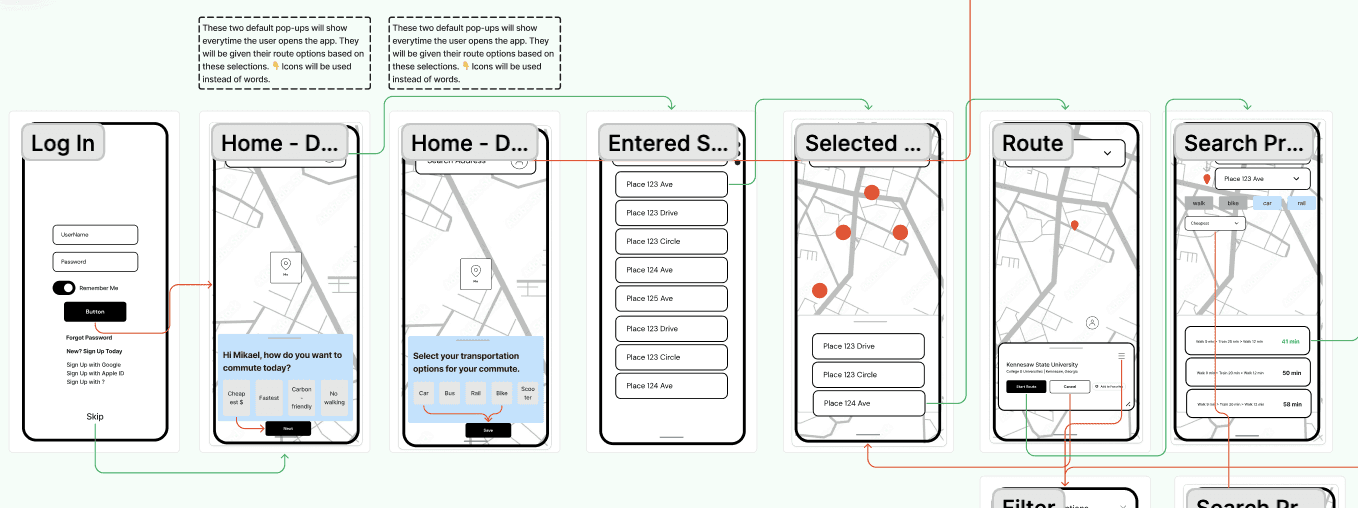
Wireframing & Prototyping: We designed low-fidelity wireframes based on our user persona and requirements list that we formed in the modeling phase of the framework (based on research findings), then crafted a key path flow and validation flow to meet the needs and goals of our persona. We checked in with Frank during the wireframing process to share our work and get his input. Frank had some concerns about these early designs but we assured him they were not what the final designs would look like nor what would be tested with users. Afterwards, we built a high-fidelity, interactive prototype to test the design with users. We shared these designs with Frank who gave us feedback.
Usability Testing: Although it is recommended to run 5 usability tests for best results, due to time constraints, we conducted 4 usability tests that asked each participant to complete a series of tasks and rate their experience of completing each task. This was enough to identify a clear pattern of similar sentiments and feedback which included: some of the map images were not high-quality, the route options screen was a bit cluttered and confusing, the in-route details screen when walking wasn’t very clear and the transfer screens weren't immediately clear that the user was changing from one form of transportation to another (ex: walking to riding a rail). All participants felt the design was like experiences they are already used to so they described it as easy to navigate, and they loved the ability to see route options based on multiple forms of transportation selected. All participants successfully completed each task and rated their experience for each task between 75% and 100% on the NPS (Net Promoter Score) scale. Based on this feedback, we made iterations to the design.
Visual Design & Style Guide: Due to time constraints, we didn't have much time to develop our own custom branding so we leveraged AI tools to help speed through this. We voted on different color palettes and logo designs we generated from a couple of different tools until we landed on our final color palette and logo. We made sure to design on an 8pt grid and chose to use similar UI patterns that other navigation apps use. This is because we know these designs work and knew reinventing the wheel would not be a good use of our time and effort. We did have time to design some custom icons while others we used were from Material's library.
Conclusion
During this project, I learned how challenging it is to design a navigation app. Initially, I thought it would be straightforward but there are many variables and considerations to keep in mind for each transportation selection, not to mention combining more than one. This gave me a newfound respect for apps that design this very well, like Google Maps and Waze where we got much of our inspiration from. If I could change anything, I’d like to spend more time on our design system and branding, specifically the color palette because I feel it does not contrast enough with the colors of the map. I also feel some of our icons, components and design patterns can be further improved. I would also make a high-quality vector version of our logo.
To end the project, we updated Frank on the usability testing results and shared with him the refined designs. He recently got a new position, so the project is paused until further notice. Ideally, Frank would like to hire more engineers to help build out the app further and leverage Google Maps API. He also wants to partner with MARTA to help streamline the experience of local Atlanta commuters. Our team is considering pitching this project to the Atlanta Tech Startup Village to generate funding and gain further feedback on its product-market fit.